Menu App
Replacing paper menus and phone calls with a seamless digital ordering experience.
Overview
Cache is the flagship product of Platform Technologies PLC, a digital room-service and food-ordering system for Ethiopian hotels. Guests can browse menus, place orders, pay online, and track delivery from their phone, replacing the printed menu, phone-based ordering, and cash-only payment that dominated the market.
I joined as UX Designer under real competitive pressure: Platform Technologies needed to ship Cache before a rival launched something similar. That shaped everything, from tight timelines and fast iteration to a bias toward decisions that were both good design and quick to build.
0
Phone calls to order
3
Major iterations
+
Online payment added
🏆
Shipped before competitor
The Problem
Ethiopian hotels ran almost entirely on paper menus and phone-based room service. It was slow and full of friction: menus were often out of date, ordering meant calling the front desk and hoping someone picked up, and cash was the only way to pay.
For hotel staff, the situation was equally chaotic: handwritten orders, verbal miscommunications with the kitchen, and no centralised view of what was being ordered or when it was expected to arrive.
“The brief wasn't simply "make a digital menu." It was to redesign the whole ordering loop, from first tap to food at the door, and make it feel as easy as ordering from Uber Eats but built for an Ethiopian hotel.”
Design Process
Walked through the existing room-service process at partner hotels with the Platform Technologies team and mapped the full guest and staff journey to find the worst friction. Ordering, payment, and communication came out as the three pain points to solve first.
Audited food ordering apps for mental model patterns: Uber Eats for ordering flow, Marriott Bonvoy for room service experience, and local Ethiopian apps for context on what patterns users were already familiar with. The goal was to build on existing mental models rather than invent new ones.
Lo-fi wireframes of the full guest journey: browse, customise, cart, checkout, track. I shared them with the team for feedback before going to high fidelity. This stage is where two big simplifications surfaced: a flat list became category tabs, and a multi-screen checkout became two steps.
Built the full mobile UI in Figma. Delivered a complete component library (cards, buttons, inputs, modals, nav patterns) with annotated specifications. The component library was designed for speed: minimal bespoke elements, maximum reuse.
Design Decisions
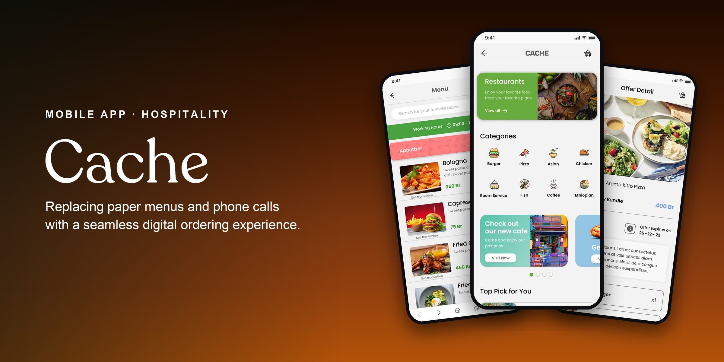
Menu display
The initial design showed all menu items in a scrollable list. Feedback from the hotel team made clear that guests couldn't orient themselves. The final design uses a category-tab navigation (Starters / Mains / Drinks / Desserts) with item cards showing name, price, key ingredients, and a photo thumbnail.
Ordering flow
The first flow had too many screens between adding an item and confirming an order. The revised flow added a persistent cart drawer reachable from anywhere in the menu and a two-step checkout (review cart, then confirm). Returning guests can reorder in a single tap from their history.
Online payment
Online payment wasn't in the original scope. Hotel partners made clear it was non-negotiable: guests increasingly expected to pay digitally, and cash-on-delivery alone was a reason to skip the app. It became a core feature, with mobile money and room-charge options built cleanly into checkout.
Outcome
Cache shipped inside the competitive window, ahead of the rival product. It became the foundation of Platform Technologies' hospitality line, and the component library and design system carried on into later versions.
The project taught me something about working under pressure: constraints aren't the enemy of good design. The deadline forced clear thinking about what actually mattered, and the result did a small number of things really well.