Future Education Mastery Accelerator
A learning platform built for Ethiopian students, from scratch.
Overview
FEMA (Future Education Mastery Accelerator, from a Ge'ez root meaning "the fire that is to be kindled within us") is an Ethiopian education platform built to make quality learning reachable for students across the country.
I designed it during the 10 Academy UX Design Accelerator: a complete mobile learning management system built from nothing, with no existing product and no prior research to lean on.
The scope was broad. One app had to serve four very different users (students, teachers, parents, and administrators), each with their own goals, workflows, and permissions, and still feel cohesive and simple rather than like four apps stitched together.
4
User types
7
Weeks end-to-end
2
Languages (EN + AM)
40+
Screens designed
The Problem
Ethiopia has one of the youngest, fastest-growing populations in the world, but its education system carries real infrastructure gaps: overcrowded classrooms, little access to extra learning material, and almost no digital link between teachers, students, and parents.
Existing LMS platforms (Moodle, Google Classroom) are built for Western contexts: they require stable internet, assume English literacy, and offer no pathway for parents to monitor a young child's progress or for administrators to approve content before it reaches students.
FEMA needed to solve for this context specifically: low-bandwidth environments, bilingual content (Amharic and English), age-appropriate access controls, and a content approval workflow so administrators could check quality before it reached students.
“The opportunity wasn't only a learning app. It was the trusted system Ethiopian education was missing: one place connecting students, teachers, parents, and schools.”
Understanding the Users
The most complex part was building a system that felt tailored to each user type without fragmenting the experience.
Primary learner
The core user. Students above Grade 6 can create their own account; younger ones go through a parent-created profile, an age gate that shaped the whole onboarding flow.
Content creator & grader
Teachers receive accounts created by admin. Primary jobs: create course content, grade assignments, track student progress, and answer questions from students and parents.
Monitor & advocate
Parents manage child profiles, enrol their children in courses, monitor grades, and contact teachers. Unanswered questions escalate to FEMA admins after a set waiting period.
Gatekeeper & manager
Admins run the whole platform: approving or declining teacher-submitted content, managing roles, viewing platform-wide analytics, and handling escalated parent questions.
Design Process
Audited Google Classroom, Moodle, Duolingo, and local Ethiopian edtech tools. Identified gaps: none offered bilingual support, offline-first thinking, or an age-gated parent/child account structure.
Built 4 detailed personas and mapped full user-flow charts for all four roles, noting where flows intersect (a teacher's grade triggers a parent notification) and where they diverge. The student flow alone had 15+ decision nodes, including the Grade 6 age-gate branch.
Created end-to-end journey maps for the student and teacher, tracking touchpoints, emotional states, and key moments from first launch to course completion. Built the full site map across all 4 roles and 40+ screens.
Wireframed every core screen for each role in Figma, putting information architecture ahead of visual design. Key calls: bottom-tab navigation with a central action button for students and teachers, simpler 2-level navigation for parents, and a data-dense dashboard for admins.
Designed the FEMA logo, colour palette, and type system, then moved to high-fidelity screens, applying the brand across all 40+ screens with consistent components, motion, and interaction states.
Built a clickable Figma prototype and ran walkthroughs with the team, then iterated on the feedback and finalised the design for developer handoff, including a full component library and annotated specs.
Design Decisions
Age-gated onboarding
Students in Grade 6 and below can't create accounts on their own; the system routes them through a parent-created profile. This wasn't a technical limitation, it was a deliberate choice to protect younger users while keeping parents informed and in control from day one.
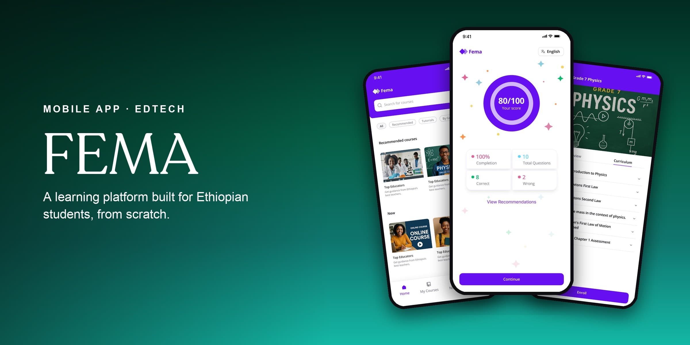
Onboarding quiz
New students are offered an optional course evaluation quiz at first launch. Completing it unlocks a personalised course recommendation list tailored to their grade and knowledge level. This creates immediate value for engaged users without blocking access for those who want to explore freely.
Content pipeline
Teachers submit course content to admins before it goes live. This was a core trust mechanism, so FEMA could hold a consistent bar on quality and curriculum. Declined content came back with clear admin feedback so teachers could revise.
Bilingual design
Every screen was designed with both Amharic and English in mind from the start, not bolted on later. That shaped field sizing, font choices, and how text-heavy screens were laid out to handle the longer word lengths common in Amharic script.
Outcome
Over 7 weeks I delivered a fully documented design system for all four roles (student, teacher, parent, and admin) across 40+ screens, with a complete component library, annotated specs, and a clickable Figma prototype.
It made a point I keep coming back to: complex multi-role systems don't have to feel complex. Investing early in user flows and information architecture meant the final product felt cohesive and approachable for every user type, despite everything happening underneath.